In the previous chapter you have learned how to re-use built-in properties in Qlik Sense' property panel. In this chapter we'll cover how we can extend the property panel to custom needs.
Introduction to custom properties
If you need other properties than the predefined ones you can create them as desired by adding custom properties.
As of Qlik Sense 1.1/2.0 you can use a collection of different UI components to display your custom properties in the property panel:
- Check box
- Input box / Text box
- Drop down list
- Radio button
- Button group
- Switch
- Slider
- Range-slider
These UI components can be grouped into sections and headers in the property panel.
Each of them exposes different configuration options to manipulate their behavior (I recommend to look into the official "Qlik Sense for Developers" documentation for more details on each of the components).
Improving readability & maintainability of properties
In previous chapters we have defined properties in the main script's definition property. That's fine, but if you have a lot of different properties and you are defining them in your main JavaScript file you'll recognize that your script file becomes quite big and hard to read and maintain.
There are several approaches to improve this situation:
- Split the definition into several JavaScript variables
- Break out the definition into a separate file and load this file in your extension's main file
The online help "Qlik Sense for Developer" nearly always uses the approach of splitting logical pieces into separate variables, so it's good to understand how this works.
I personally recommend to combine both approaches, which helps me a lot to make all my extensions easier to maintain.
Initial situation:
define( [],
    function ( ) {
        'use strict';

        return {
            definition: {
                type: "items",
                component: "accordion",
                items: {
                    dimensions: {
                        uses: "dimensions"
                    },
                    measures: {
                        uses: "measures"
                    },
                    appearance: {
                        uses: "settings"
                    }
            },
            paint: function ( $element , layout ) {
                // Your main rendering logic here
            }
        }
    }
);
So let's start refactoring:
Separate properties file:
Create a file called "properties.js" and put it into the same folder where the main file of your visualization extension is located. In this very simple example the file will look as follows:
define( [], function () {
    'use strict';

    // *****************************************************************************
    // Dimensions & Measures
    // *****************************************************************************
    var dimensions = {
        uses: "dimensions",
        min: 0,
        max: 1
    };

    var measures = {
        uses: "measures",
        min: 0,
        max: 1
    };

    // *****************************************************************************
    // Appearance Section
    // *****************************************************************************
    var appearanceSection = {
        uses: "settings"
    };

    // *****************************************************************************
    // Main property panel definition
    // ~~
    // Only what's defined here will be returned from properties.js
    // *****************************************************************************

    return {
        type: "items",
        component: "accordion",
        items: {
            dimensions: dimensions,
            measures: measures,
            appearance: appearanceSection

        }
    };

} );
Your main script:
In your main script load the external definition of properties and assign it to the properties' definition:
define( [
        // Load the properties.js file using requireJS
        // Note: If you load .js files, omit the file extension, otherwhise
        // requireJS will not load it correctly
        './properties'
    ],
    function ( props ) {
        'use strict';

        return {

            definition: props,
            paint: function ( $element , layout ) {

            }
        }
    }
);
Comparing these two examples it's not quite obvious why this is actually an improvement, but as soon as we add more to the property panel definition, you'll recognize the advantages of this approach.
Basic custom property - a string input box
Let's have a look at the most basic but at the same time also most common component, the text box and how to define it:
// Text box definition
var myTextBox = {
    ref: "props.myTextBox",
    label: "My Text Box",
    type: "string"
};
In the definition of every UI component there are some common properties which can be set:
| Property | Description |
|---|---|
type | Used for all custom property type definitions. Can be either string, integer, number or boolean. |
ref | Name or Id used to reference a property. |
label | Used for defining the label that is displayed in the property panel. |
component | Used for defining how the property is visualized in the property panel. |
You may be wondering yourself why we haven't defined the component in the example above: In case of a UI component of type string or integer without defining a specific component Qlik Sense defaults automatically to a text box.
Adding the component definition to the property panel
As we have now defined the custom property - in our case a string based text box - we now have to add it to the accordion. The easiest approach to achieve that is to add the new custom property to the built-in "Appearance" section:
Code before adding myTextBox:
// Re-using the appearance section
var appearanceSection = {
    uses: "settings"
};

// Return overall definition of the property accordion
return {
    type: "items",
    component: "accordion",
    items: {
        appearance: appearanceSection
    }
};
Result:
Code after adding myTextBox:
// Text box definition
var myTextBox = {
    ref: "props.myTextBox",
    label: "My Text Box",
    type: "string"
};

// Appearance section, now re-using the appearance section + injecting our myTextBox component
var appearanceSection = {
    uses: "settings",
    items: {
        myTextBox: myTextBox
    }
};

// Return overall definition of the property accordion
return {
    type: "items",
    component: "accordion",
    items: {
        appearance: appearanceSection
    }
};
Result:
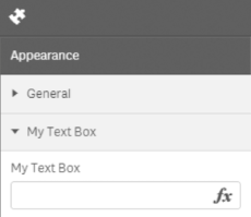
So what happened here?
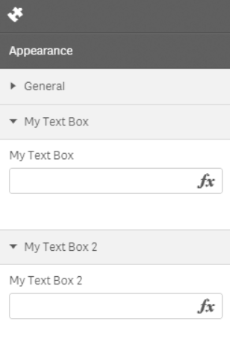
You'll realize that not only our text box component was add but also a header was created automatically re-using the label of our component. Let's verify this by just adding another text box component:
var myTextBox = {
    ref: "props.myTextBox",
    label: "My Text Box",
    type: "string",
    expression: "optional"
};
var myTextBox2 = {
    ref: "props.myTextBox2",
    label: "My Text Box 2",
    type: "string",
    expression: "optional"
};

// Appearance sectiion, now with two text boxes
var appearanceSection = {
    uses: "settings",
    items: {
        myTextBox: myTextBox,
        myTextBox2: myTextBox2
    }
};

// Return overall definition of the property accordion
return {
    type: "items",
    component: "accordion",
    items: {
        appearance: appearanceSection
    }
};
Adding a custom section header
That's fine, but in many case that's probably not the result we'd like to achieve, it's probably more common, that we want to create a new header within a section containing several components, so something like that:
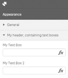
To achieve this result, we have to create a new header (myNewHeader) into the existing section "Appearance" - which is loaded by uses: "settings" - and add the items there:
var appearanceSection = {
    uses: "settings",
    items: {
        // Here the magic happens ...
        myNewHeader: {
            type: "items",
            label: "My header, containing text boxes",
            items: {
                myTextBox: myTextBox,
                myTextBox2: myTextBox2
            }
        }
    }
};

// NOTHING CHANGED HERE ...
// Return overall definition of the property accordion
return {
    type: "items",
    component: "accordion",
    items: {
        appearance: appearanceSection
    }
};
Adding a custom section
Until now we have
- added custom items to the built-in section "appearance"
- added a new section header to the built-in section "appearance"
But we haven't covered so far how to create a new accordion section, so let's create one:
// Some components
var header1_item1 = {
ref: "props.section1.item1",
label: "Section 1 / Item 1",
type: "string",
expression: "optional"
};
...
...
// Define a custom section
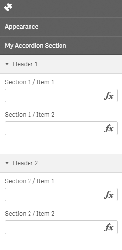
var myCustomSection = {
// not necessary to define the type, component "expandable-items" will automatically
// default to "items"
// type: "items"
component: "expandable-items",
label: "My Accordion Section",
items: {
header1: {
type: "items",
label: "Header 1",
items: {
header1_item1: header1_item1,
header1_item2: header1_item2
}
},
header2: {
type: "items",
label: "Header 2",
items: {
header2_item1: header2_item2,
header2_item2: header2_item2
}
}
}
}
The key in the code above is that you add the component expandable-items the rest of the code works as all the other examples.
Then let's again just use it:
return {
    type: "items",
    component: "accordion",
    items: {
        appearance: appearanceSection,
        customSection: myCustomSection
    }
};
The result is a custom accordion section with section headers and items:
Display & persistence
Once the custom properties are defined, Qlik Sense takes care of the rest:
- Showing the custom properties together with the built-in ones
- Persistence of property values, so if a user changes the value of a property, you don't have to take care of persisting (saving and loading) the property value
Referencing property values
Referencing the property values of custom properties is not very much different from referencing values from built-in properties, with one exception:
By using ref you can define how the property value is exposed in the object tree. This principle applies to all custom property items.
Two examples:
By defining a text box using
var myTextBox = {
    ref: "myTextBox",
    ...
};
the value can then be referenced in your script
console.log( layout.myTextBox );
whereas
var myTextBox = {
    ref: "prop.myTextBox",
    ...
};
will then be called using
console.log( layout.prop.myTextBox );
I personally prefer to prefix all properties with props. Firstly this doesn't messy up the root of layout, secondly this approach allows me to easily iterate through all custom properties and thirdly ensures that there are not naming conflicts with the standard object of Qlik Sense (even in future versions of Qlik Sense).
Troubleshooting
Changes are not reflected
If you are changing the properties of an existing visualization extension you might run into the issue that changes in your extension's code are not reflected in visualizations based on this specific extension.
In this case remove the existing object and re-create it and you should see the changes made to the property panel.
This behavior only applies if you are making changes to the definition property of a visualization extension, not if you are e.g. making changes in the paint implementation.
Source code for this chapter
You can find the source code for this chapter in the src folder of ./Chapters-Source/07-Custom-Properties/ (direct link)